Exploring Colour For Masthead

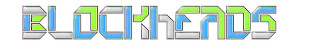
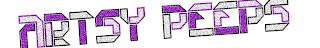
As you can see from bellow i have been exploring on fireworks various methods such as blur,noise,invert colour,bevel bosse and many other methods to try and create and unusual font which will capture my readers attention but is fitting with the genre at the same time as you can see i have used various mast heads to do so as i didn't want the name to deter people opinions and bellow is and account of what results i have found.


IIIIIIIIIIIIIIIIIIIII (17)


IIIII(5)


IIIIIIIIII(10)
IIIIIIIIIIIIIIIII(16)


IIII(4)
IIIIIIII(8)

IIIIIIIIIII(12)


IIIII(5)


As you can see again there is a clear winner the reason i think certain font did'nt do as well is manily due to colour schemes which people have told me that they were to feminine or male based so i think the colour scheme choosen keeps with the neon and bright theme of indie and caters for all and at the same time graps peoples attenson as the mast head can be the make or break of a magazine.
Feedback From Miss Walton
1. colourful one is very striking and vibrant and fits with the genre.
2.Blockheads is good but it its is very directed to one sex socail group eg.males
3.The noise added and the colours are very intresting but the purple and white are a bit bland
4.Thuis is clever as it adds together the colours of the previous two and has a good use of a tapper but this still is'nt my favourite.
5.The black ground of the noise in the title is boring and would only be suitable for black magazine which is steroptypical of your genre.
6.I like this one becuase it uses two colours which are sterotypically male and female,but it being embossed is unrealistic and unconventional for a magazine.
7.The same opionon i have applies to the one above but the emboss is gone which is more realistic.
8.


Exploring Titles for my Final Magazine Cover

For my magazine cover i used many research methods to get a wide range of possible names for my music magazine,these were such as :-
  • I asked my target audience to suggest names becuase these would be the ones who would be attracted and buy the magazine.
  • I used internet research of exsisting magazine names and used this to devolp my own from the natue and whee the magazine names were produced eg. kinds of words used.

This is the list of names i have produced but feel free to suggest any other possible names and if you feel merging ideas would produce a effective title please do suggest.

From the list bellow please can you indicate from the numbers at the side of the name which one/ones you preffer.

  1. Tunage III (3)
  2. Artsy peeps IIIII(5)
  3. obscure IIIIIII (7)
  4. indiedom IIIIIIIIIIII (12)
  5. Indiemannia IIIIIIII(9)
  6. Britpop Indie II (2)
  7. MODcloth IIIIII (6)
  8. Retroindie IIIIII(6)
  9. stereotypical?IIII(4)
  10. Finalposition II(3)
  11. Blockheads IIIII (5)
  12. IndieFix IIIIIIIIII IIIIIIIIII III(23)

Feedback

Claire Robertson:- Blockheads (11),Britpop Indie (6),Indiedom(4)

Rachael Squires :- indiedom(4),Indiefix(12),Arsty peeps (2)

Joshua Whitehurst :- indiemannia (5),indiedom(4),Arsty peeps (2)

Laura Ward :- indiefix(12),obscure(3),idiedom(4)

Amy Gerrard :- final position (10),indiefix(12),indiedom(4)

Christine Foster :- indiefix(12),indiedom(4),obscure(3)

Tom Baddeley:-indiemannia(5),MODcloth(7)

Viki Dempsey :- indiefix(12),Indiedom(4)

Sophie Maneley :- obsurce(3),indiedom(4)

Jade Breed:- indiedom(4),indiefix(12),obscure(3)

Ben Dobson:-MODcloth(7),indiedom(4)

Above are just some of the people i asked for an opinion on what name would attract my target audience best and make my magazine successful as you can see from the results above and from the overall numbers Indiefix came out top and indiedom a close second but as you can see all the magazine names were vert popular.Overall i am very happy with the choice of my target audience as i bleive it has relevence and is simple and sweet.

Exploring Typefaces for my Final Magazine Cover

(Please bare in mind all the typefaces feature in thier name not a potentional magazine name.)

Bellow is a variation of fonts which i have accumulate through out my research, I am intending to peruse a rock/indie genre of magazine and i would like you to consider when commenting on which one you deem most suitable these simple points :-
1.What first attacked you to the typeface you chose and why
2.Is it suitable for the genre of magazine I am perusing?
3.What colours do you suggest it to be featured as?
4.What does the typeface symbolise to you or represent?
Typefaces
1. IIIIII (6)


2. IIIIIIII (8)


3.IIIIIIIIII IIIIIIIIII IIIIIIIIII IIII (34)


4.IIIIIIIII (10)


5.IIIIII (6)


6.II (2)

7.I(1)

As you can see from my results there was a clear favorite with my audience.I have asked my audience why i they have choosen this font and the genral response was that the geometric shapes mirrored the image and shapes used by the typical indie band and instintanly suggested the genre to them.I am happy with this response as i also saw the link between the genre and shape and i beleive with the black outline will work wel with any colour scheme i pursue.

Letters To Music magazines concerning research

Today i have sent off numerous emails to music magazines varying from NME.com to Smash Hits to get feedback on a variation of genre's and what methods they use to capture such different effects yet are affective in capturing its target audiences.

I have asked numerous questions in persuit of advice as well as for merchandise which i can use as inspiration in my work, bellow is a copy of the letter i have used and i will update this post with any information i recieve reguarding my emails.

Dear whom this may concern,

I am a student from Biddulph High School Sports College and I am studding media studies at AS level. I am interested in many areas of media especially photography and film, but have specifically chosen to take forward print as a part of my coursework to enable me to explore this aspect of media as at A2 film is compulsory and this way I believe I will get a wide understanding and interest of the media world. The specification of the coursework is ‘To create a original music magazine of the genre of my choice and through research and analysis create a front cover, content page and a double page spread with my own photography and original stories’. As a part of my coursework, I have been using your magazine to analysis and report on and I find the mise-on-scene and photography used very effective in every issue and I am also interested in perusing and creating a magazine of the same genre. So basically I am writing to you to ask if you had any information about the magazine such as :-
Why you use the graphics you do?
How you use camera angles to assist the artist in portraying a certain message
How to create the perfect Masthead?
How to come up with the perfect magazine name?
What makes an interesting story?

And anything else you deem appropriate and any advice would be very grateful and would assist me in creating a perfect magazine.
hank you for your time,
Jessica Squires

Preliminary Project Review Questions

I am conducting this review to gain constructive feedback which i can use to improve and use to my advantage to produce a good coursework piece.So please give constructive feedback
thank you

Front Cover Review

1. What is your first impression of my Front Cover of a school magazine?
(eg. what grabs your attention? Colours, image and why?)


________________________________________________________________________________________________________________________
2. What is your view on the mid-shot that fills the whole front cover does it serve it purpose? (Comment on the props used, location, costumes)

______________________________________________________________________________________________________________________________________________________________________________________________________________________________________________________________________________________________________________________________________________________________________________________________________________________________

3. Is the layout of the stories inside effective?
(Things to think about :-Does it act as a good basis for the images and wording? ,Does it hinder the photograph? ,Does it keep in with the theme of the magazine?)
_______________________________________________________________________________________________________________________________________________________________________________________________________________________________________________________________________________________________________________________________________________________________________________________________________________________________

4. Do you think the mise-on-scene used on the magazine is effective and why or why not?
(Things to think about: - the colour scheme used, the photography used, The typeface used for mastheads and subtitles)
_______________________________________________________________________________________________________________________________________________________________________________________________________________________________________________________________________________________________________________________________________________________________________________________________________________________________
_______________________________________________________________________________________________________________________________________________________________________________________________________________________________________________________________________________________________________________________________________________________________________________________________________________________________


5. If you would change anything about the front cover presented above what would you change and why?
(Comment on mise-on-scene – colour scheme, props used, location, type face etc.)
_______________________________________________________________________________________________________________________________________________________________________________________________________________________________________________________________________________________________________________________________________________________________________________________________________________________________
____________________________________________________________________________________________________________________________________________________________________________________________________________________________________________________________________________________________________________________________________________

Content Page Review

6. What is your first impression of my Content Page of a school magazine?
(eg. what grabs your attention? Colours, image and why?)


______________________________________________________________________________________________________________________________________________

7. What is your opinion on the layout of the content page?
(Things to think about? - The dividers used, colour scheme, background used, imagery used, type face)
______________________________________________________________________________________________________________________________________________

8.Does the magazines mise-on-scene etc. fit with the theme of the magazine and are the stories used relevant?
(Also comment way they have been presented, genre)
_________________________________________________________________________________________________________________________________________________________________________________________________________________________________________________________________________________________________________________________________________________________

9.Do you think the simplistic design is effective and different than the conventional school magazine if not why?
____________________________________________________________________________________________________________________________________________________________________________________________________________________________________________________________________________________

10. Do you think the mise-on-scene used on the magazine is effective and why or why not?
(Things to think about: - the colour scheme used, the photography used, The typeface used for mastheads and subtitles)
___________________________________________________________________________________________________________________________________________________________________________________________________________________________________________________________________________________________________________________________________________________________________________________________________________________________________________________________________________________________________________________________________________________________________________________________________________________________________________________________________________________________________________________________________________________________________________


Preliminary Project - School Magazine (Biddulph High School)

Preliminary Project / Front Cover

My aim for this project was:-
1.Create something eye catching and interesting
2.Produce something original that is still appropriate for the target audience and useful.
3.Make the focal image capture the theme of the magazine in a subverted way.
Overall I believe I achieved this but if anyone has and suggestions on areas I can improve it would be very useful for my coursework.

Mise-on-scene

Colour Scheme: - The colour scheme I have used is based around the school colours which are dark blue and a sun yellow compliment each other and give a interesting basis to work on, I tried to incorporate and use various gradients of these colours to give variation and interest to the masthead by using block colour and alternate colouring which I believed worked well. Also I believe the colours worked well as a basic background in the jigsaw pieces and the background which acts as a page divider.

The Main Image:-The image I used ,I tried to capture what the school is recognised for which is being a sports college and in the image I tried to sow or represent the wide variation of sporting activity the school offer and I believe the mid-shot enabled me to capture the school uniform and the youth of the school.I decided to take the picture in the outdoor setting as it acted as a neutral background as well as being more interesting than a blank canvas but also links with the sporting theme of the magazine.

Mast head and sub-headings
With the masthead in kept this the same font as the Biddulph High logo to link the magazine together. The subheadings I used almost like newspaper clippings to symbolise headlines which is I believe affective and is away from the conventional theme of a magazine which I was trying to active a funnier younger target audience. I also incorporated the jigsaw pieces from the Biddulph High school logo to make an interesting banner acting as a story board almost in the colour scheme which again work well with the images not hindering them.

Content Page
Masthead
I decided to keep the masthead the same for the title of the content page as the front cover as it gives continuity and I also kept it the same for the subheadings an s the type face is bold and stands out as a divider.
Mise-On-Scene
I found it hard to find a satisfying way of presenting the stories and there page numbers in the end I thought I wanted a neutral background so I decided to keep in with the them of school and used stationary items to break up the white which I believe is quiet effective. I then used a basic type face which looks like an old school type writer which I believe ties together the page and theme of the section. I then used postic notes which I attached to the images I had used to symbolise the nature of the story which I edited and changed to fit in with the colour scheme.

I then created dividers which I again put in the colour scheme of the school which were affective and showed a clear divide. I again used the jigsaw pieces to present my pictures which linked to the stories on the left hand side. Only presented these in yellow as the background was dark blue which again meant there was little left space as the colour gives it interest so it isn't bland.

On the contents page I used the school logo much more to fill open space and to show the link between the colour scheme and shape used and because the magazine is for the school and I then incorporated the sports college logo to symbolise there unity.

I then used Olympic pictograms which I edited to introduce the stories to the right together with postic note the simplicity of both work well.

Again I believe I have created a success piece but if anyone has any input they would like to give it would be very helpful for my coursework so I could implement changes.